December 29, 2023

Improving Electrify America and EV Charging

Last year my wife and I purchased our first electric car - a Hyundai Ioniq 5 - and we love it! Range anxiety is mostly not an issue and the included 120V charger is enough to keep our battery topped up for most of our daily driving. For longer trips we’ve been relying on the included two years of free 30 minute Electrify America sessions that come with each Ioniq 5. As the number of EVs on road continues to increase, however, the EA network is struggling to scale. During most of our trips to an EA station we’ve seen many broken charging stations and lines of cars waiting to charge.

ICE cars, gas stations, rest stops, etc have had over 100 years to get to where they are. Most drivers know how to fill up a car with the right type of fuel. Gas stations are designed to easily drive through so that cars can form a queue. Filling a tank of gas only takes about 5 minutes and pump can fill at the same rate from empty to full. This all changes with EVs.

How fast can my car charge?

Unlike a gas pump which can fill all cars at the same rate from empty to full, EVs have a more complex charging rate that’s based on a combination of the station, the car’s EV architecture, and the car’s charging curve.

Station speed and the car

Not all EVs can charge at the fastest rates. Most EVs can’t charge faster than 150 kW. Why does this matter? If there’s a line of cars waiting to charge, a mismatch between charging speeds can really slow things down. For example:

At a 150 kW charging station one 2022 Hyundai Kona would take 44 minutes to charge up to 80% because it can never charge faster than 77 kW. Even at a 350 kW “hyper fast” charger the car is still only charging at 77 kW.

EVCar’s max charging speed10 to 80% at 150 kW10 to 80% at 350 kW
Hyundai Kona77 kW44 min44 min
Hyundai Ioniq 5233 kW22 min17 min
Note: Filling a gas tank for a similar range would take about 2 minutes.

If a Kona were to arrive first and choose the “hyper fast” charger, they add 5 minutes charging time for the Ioniq while they still have to wait the same 44 minutes. Five minutes may not seem like much, but if there’s a queue of cars waiting this can really add up.

The charging curve

So far we’ve only charged to 80%, however. What happens if a car charges beyond that? All EVs slow the charging speed as the battery fills up to help protect the it. Charging the last 20% of a car’s battery can easily double the total charging time.

EVCar’s max charging speed10 to 100% at 150 kW10 to 100% at 350 kW
Hyundai Kona77 kW124 min124 min
Hyundai Ioniq 5233 kW50 min45 min

One Kona charging to 100% takes as long as 3 Ioniq 5s. If those Ioniqs are charging to only 80% 7 cars could’ve charged in the time it took the Kona to get to 100%.

These estimates are under ideal conditions and assuming all cars show up at the same time and don’t linger at the station after they finish charging. In less ideal conditions a single slow charging car on a fast charger can create serious backups.

This stuff is complicated and most EV owners don’t know about it (and they shouldn’t have to!). Names like “hyper” and “ultra” are meaningless, dealers don’t educate, and really the end-user shouldn’t have to be thinking about this math every time they charge.

How do we improve?

So what can we do in a world where every EV has a different max charging speed, every charging station has a different mix of rates, and some EV drivers may still need to charge to 100% to reach their destinations?

1. Let computers do the math

With EV charging rates changing every year, it’s not fair to ask consumers to know what charger is best for them. At the end of the day if someone sees a charger that says “350 kW” and another that says “150 kW” most people will choose the 350 kW option - even if their car can only charge at 77 kW.

The charging infrastructure, however, can easily know the max speed for each car and assign them to the best charger automatically. This would help avoid confusion for the customer and help keep charge times as low as possible for all cars.

2. Predict demand

Today’s EA app is very dumb. It shows you what’s currently available but isn’t able to forecast how busy a charging station will be. The app should have an idea of how busy a charger will by the number of views it has at any given time and could even include people who are navigating to the charger in the queue.
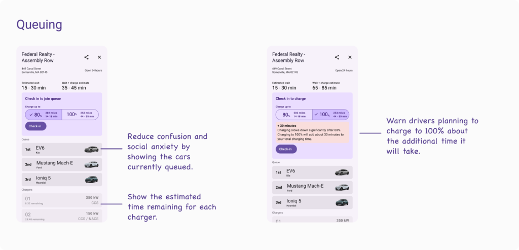
3. Use a queue

Most EV chargers today are first come, first served. This works ok for the first few cars, but once there’s a queue it can be confusing to determine who’s next. Additionally you never know when someone is going to charge to 100% and sit on a charger for over an hour.

The queue could be optimized for minimizing the total wait + charge time ensuring that chargers are assigned in an order that gets everyone through the queue as fast as possible.

4. Encourage charging to 80%

Rather than penalizing users for charging to 100% we can encourage them to charge to 80% to optimize charging times for all customers. Drivers who need the extra miles can still charge fully, but for those who don’t need to we can help them understand the extra time and cost of charging longer.

What could this look like?

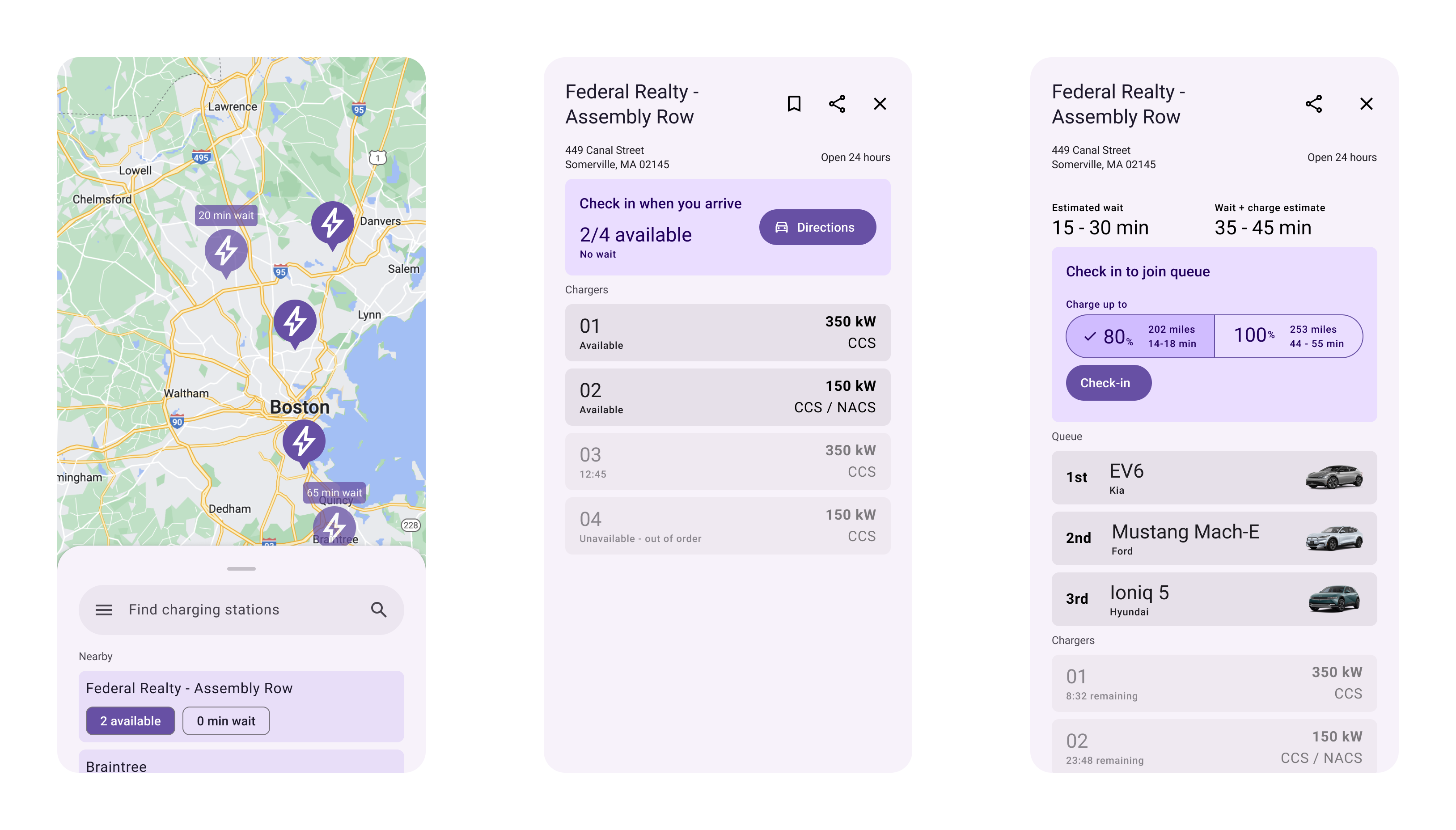
When finding a charger the app could focus more on overall wait time rather than current availability.

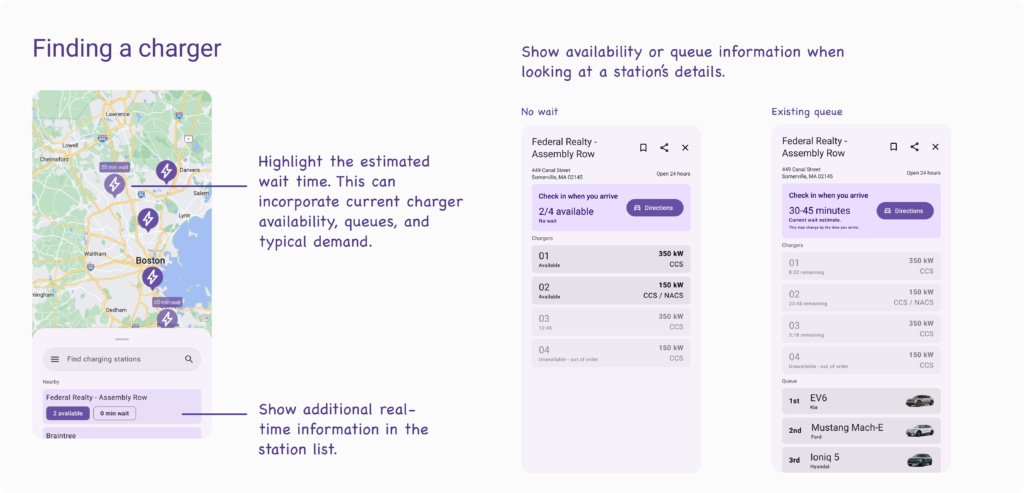
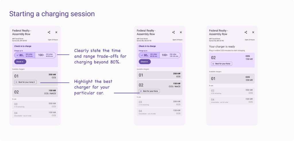
When a driver checks in the app can show them the estimated time difference for charging to 100%. Additionally the app can highlight which chargers best match your car’s max charging speed.

If no chargers are available, the app can show the estimated wait time as well as your total time at the station.

Thanks for reading!

This blog post is meant more as a conversation starter rather than a complete solution. I’d love to hear what you think about a queuing system, charging to 80% instead of 100% and all the other charging challenges out there today.

Send me a note on Threads to let me know what you think!

I also owe a huge thank you to my amazing wife Zara Fishkin who’s a principal content designer at Slack and helped me think through and edit this post.

FAQ

Why would Electrify America want to do this?

EA charges per kW delivered. They should want to maximize the number of cars they can charge in any given time period.

What about non-Electrify America chargers?

I mostly focused on Electrify America, but this all still applies to other chargers like EVgo and ChargePoint. Older Teslas also charge at different rates and superchargers from different generations have different max speeds.

What if someone wants to charge without using the app?

I totally agree. I selfishly ignored this in my thought experiment to keep things simple, but there are going to be plenty of drivers who want to charge without dealing with a number of apps. One idea would be to have charging stations provide a check-in kiosk for drivers without the app which could also show the queue and wait times like traditional gas stations show prices on large displays today.

What if I need to charge to 90%?

A driver can stop charging at any time. I’d originally started with a very flexible slider input so users could set any percentage as their target charge level, but decided to go back to 80% where speeds tend to start dropping and 100% which many drivers choose to charge to. These two options are enough to help estimate wait times and show the time / range trade-offs for a longer charging session.

September 7, 2020

Calculating property taxes

TL;DR

In late 2019 we started the process of buying our first house and found estimating property taxes in NY to be more difficult than it should be. I learned how to calculate taxes, found a state-provided tax spreadsheet, and wrote a small web app to estimate property taxes on the go.

Overview

Late in 2019 my wife and I decided to move back east after a little over three years in the Bay Area. We started looking at homes in New York and while there's plenty we had to learn about the home-buying process, what really threw me for a loop was how important it was to calculate property taxes.

Understanding the tax implications of each property is essential in planning a budget. A property tax difference of just $833 per month means an extra $10,000 per year. Assuming you live in the home for 10 years you're looking at adding $100,000 to the total cost of your home.

But getting to this total property tax figure isn't an easy task. First, property taxes are complicated to calculate. The tax for each property is a sum of taxes from a number of different entities like the county, town and school district for that property. Second, unlike sales tax which is often shown as a percentage, property taxes are usually presented as a mill rate.

What is a mill rate?

According to Investopedia:

The mill rate is the amount of tax payable per dollar of the assessed value of a property. The mill rate is based on "mills." It is a figure that represents the amount per $1,000 of the assessed value of the property, which is used to calculate the amount of property tax.

https://www.investopedia.com/terms/m/millrate.asp

Ok so what does that mean for us? If you were to find a mill rate presented as a dollar value you could calculate the effective tax for that rate relatively easily.

mill rate * property value / 1000 = tax cost

For example:

A $20 mill rate on a $100,000 property would be $100,000 * 20 / 1,000 or $2,000.

As a first-time home buyer it was easier for me to think in percentages since it matched my model for other taxes. We can just move the decimal by one spot so that $20 mill rate becomes a 2% tax.

mill rate / 10 = tax percentage

To figure out what the tax impact of a property is going to be we need to start with adding up each of the individual taxes.

Multiple jurisdictions

Property taxes can be levied by a number of authorities for any given property. In New York state this means your effective property tax rate is the sum of:

  1. County tax
  2. City OR town and village tax
  3. School district tax

There may also be additional taxes for specific departments like the fire department. Finding the tax rates for each jurisdiction can be tricky. They're not easily searchable on Google and most search results show only county averages. Since the county is only 1 of multiple jurisdictions, however, taxes can vary significantly by property, making the average a less than ideal tool for estimating budgets. To determine the effective rate for any given property you need to get the tax rate from each of the separate agencies. Complicating things even further is the fact that a property can have a postal address for one town and be managed by another. If you live in a town you might also live in a village which applies additional taxes.

At first I tried finding rates on the county, city, or town websites. Not all municipalities listed this information publicly and some of it wasn't up to date. When I did find information it was presented in spreadsheets I had to download and parse. I started keeping notes for the tax rate as a percentage for each of the towns and villages we were looking in.

Building a calculator

I eventually lucked out and was able to find a state-wide list of property tax rates for each county, city, town, and village in New York. With this spreadsheet I could find the taxes for each entity and add them together for each house we were looking at. This worked well for houses we planned to visit in advance, but we'd often find new homes as we were visiting others. I wanted a quick and easy way to calculate taxes at any time from my phone which created the perfect opportunity for a mini web app.

I converted each of the tax spreadsheets into JSON and wrote a set of filters to show only the appropriate school districts and villages within a city or town. As you select each entity the following entities are filtered so you never have to worry about finding / matching the correct villages with your selected town.

Next I added an optional field to capture the estimated property value so you can see the actual tax implications in dollars. The results table shows the mill rate, tax rate as a percentage, and the total cost per year while showing the rates for each entity.

I used Bulma to simplify my CSS and wrote the rest in vanilla JS and HTML. Since there is nothing to save, hosting was as simple as pushing a new folder to my personal website. I made the site mobile friendly so I could visit it from my phone and it ended up coming in pretty handy as we looked for a home.

What I would do next

I'm not sure what the property tax situation is in other states, but if it's as confusing as it is in NY then I think it would useful to add additional states to the app. It would also be great to be able to save particular property tax estimates so you can keep track of multiple properties instead of having to fill out the form each time. Finally I didn't look into how this would work for other types of properties. I'm not sure how condos or rental properties are taxed for example. It'd be great to extend this to include more property types in the future. For now, however, the calculator got the job done for me and I've had plenty of home projects to keep me busy in a nearly 100 year old home.

January 17, 2019

Codea on Menus in iOS

I've been using an iPad Pro on and off for the past year and have yet to find a way to use it as my daily work machine. Some of this is due to missing applications like Sketch or Adobe XD, but also in the limitations of most iOS apps. Mobile apps are simple, accessible, and focused, but don't typically offer the robustness of desktop counterparts.

Codea recently addressed this gap as co-creator Simeon wrote in a recent blog post:

I realised six months ago as I was using my Mac, using the menus, that I need these things — menus — in Codea. I was trying to solve a problem that has been solved for decades.

So I set out to make the best menus I could make for iOS.

For simple apps, menus aren’t necessary, and that’s great.

But Codea isn’t a simple app and there’s nothing I can do about that.

What it can be is discoverable. Compared to all the options I considered, menus are exactly that, discoverable. You pull down a list of named features complete with shortcut keys (if a keyboard is attached). Then you activate that feature by tapping on it, or by dragging your finger and releasing.

Hamburger menus, side-drawers, whatever you want to call them, are a conventional way to bury additional and often unrelated functionality into an app. But they are much heavier than the good old-fashioned menu bar. They often pull out a whole modal side-thingy, maybe they slide all your content to the right. It’s a context switch for your brain.

Menus categorise items under common, plain-text headings, and they appear and disappear without fanfare.

I wanted menus that looked beautiful, looked like iOS, and felt great.

https://codea.io/blog/the-ios-menu/

Simeon perfectly describes the missing component in many of today's productivity apps - discoverability. Features and complexity are often dropped for the sake of simplicity, sacrificing the value of the app. But Simeon doesn't just stop at adding menus to Codea, he dives deeper in a second post to focus on the interactions.

The other interaction I really needed for this menu was something I first noticed in Procreate, an iPad app for painting. It uses popover menus to allow the user to change tools and colours. Standard iOS popovers require the user to tap outside the popover to dismiss it before she can interact with the background. In Procreate, you can just start drawing and the popover dismisses.

This behaviour gives the menus their lightweight feel. They don’t stutter your interactions with the rest of the system. The clip below shows what happens when you scroll the editor with an open menu.

There are so many great details in this piece, but I particularly love how he handled scrolling for various device sizes and his brilliant implementation of dynamic button colors for increasing legibility (see the video).

February 11, 2018

The quantified self: Wedding edition

Who says you can't quanitfy love? I tracked my heart rate during our wedding ceremony in September and time-stamped a few highlights with the help of photos from family, friends, and our official photographer. I tried a few different tools for creating the chart (Google Sheets, Numbers, Sketch, etc.) but eventually landed on Plot.ly for the interactive annotations.


Plot 2

I wore the heart rate monitor under my shirt cuff to keep it out of the photos and against my skin. I'm sure it moved around a bit, but I was happy to see repeated measurements even after some of the steep drops or climbs.

Waiting for it to begin

www.sethkaye.com

My heart rate climbs slowly but steadily towards the beginning of the procession. The wedding party waited inside for everyone to be seated before the procession started. We could see the guests arriving, chatting, and getting to their seats through the windows of the auditorium we were waiting in. I definitely got more and more nervous watching and waiting.

Calm during the vows

A lot of friends and family have pointed out how the vows and then exchanging the rings seemed to calm me down a lot. It definitely did. I think part of the calm came from the most normal moment in the entire wedding. The whole day is this crazy ordeal. The two of you are the center of it, but it's not really about you. It's about celebrating with your friends and family, making sure the buses arrive when they're supposed to, remembering how slowly you have to step to take up all the time of the music during the processional.

But when it came to the vows it's really just the two of you again. Vows can be cliche and overplayed, but at the end of the day it was just me and my wife telling each other how we felt. Sure everyone else was there, but the words were just for us.

The glass

Oddly enough I was most nervous about this. Stepping on a wine glass isn't the most natural thing in the world. Not only that, but my father-in-law warned me not to step too hard as he'd actually injured his ankle at his wedding. You don't really get to practice either - unless you order extra glasses or have some at home you're not fond of.

Needless to stay I stepped a bit too delicately and needed a second attempt. If my heart rate wasn't up from the nerves it definitely was up from the embarrassment!

Blurred for friends privacy

Full day

Here's the full day chart from the actual Fitbit app. It's crazy to me that breaking the glass topped everything - including dancing at the reception!

November 16, 2017

How Twitter solved the character problem for different languages

Great writeup from Josh Wilburne of Twitter detailing the challenges of designing for the 140 character limit across the world. Two major aspects that stand out:

Automatic density-based adjustments

With this in mind, we designed a system that defines two types of written languages, dense and non-dense, and expands the character limit for non-dense languages.

Continuous insight

While I thought removing the UI until it was relevant would help alleviate the stress of the character limit, it ended up having the opposite effect; people were unable to properly plan their Tweet since they had no feel for how far along they actually were.

There's plenty to debate in the final implementation (as there always is in design), but I love the outside box thinking to classify languages, adapt automatically, and to show progress throughout composition, regardless of the language.

Designed by Will. 

Built with Wordpress, Semplice, and some homemade HTML, CSS, and Javascript.