Personal
Design exercises
Below are a few examples of different exercises and explorations I've done over the past couple years. The goals for each exercise differed, but the overall theme was to explore different patterns across mobile platforms while solving a particular design challenge.
Learning names and remembering faces
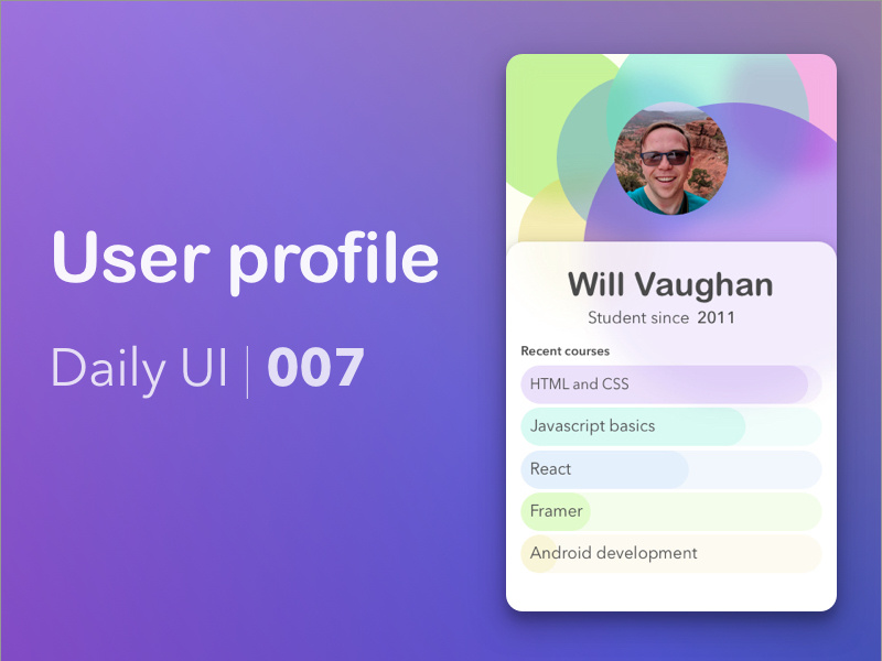
In this exercise I tackled the problem of getting to know a new set of people. While this concept focuses on helping teachers learn a new set of students, the concept could easily apply to other scenarios like starting a new job. Here I incorporated a few types of learning techniques and addressed some pain points some teacher friends of mine shared - like making sure they're pronuncing their students' names correctly.
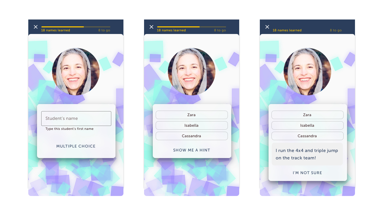
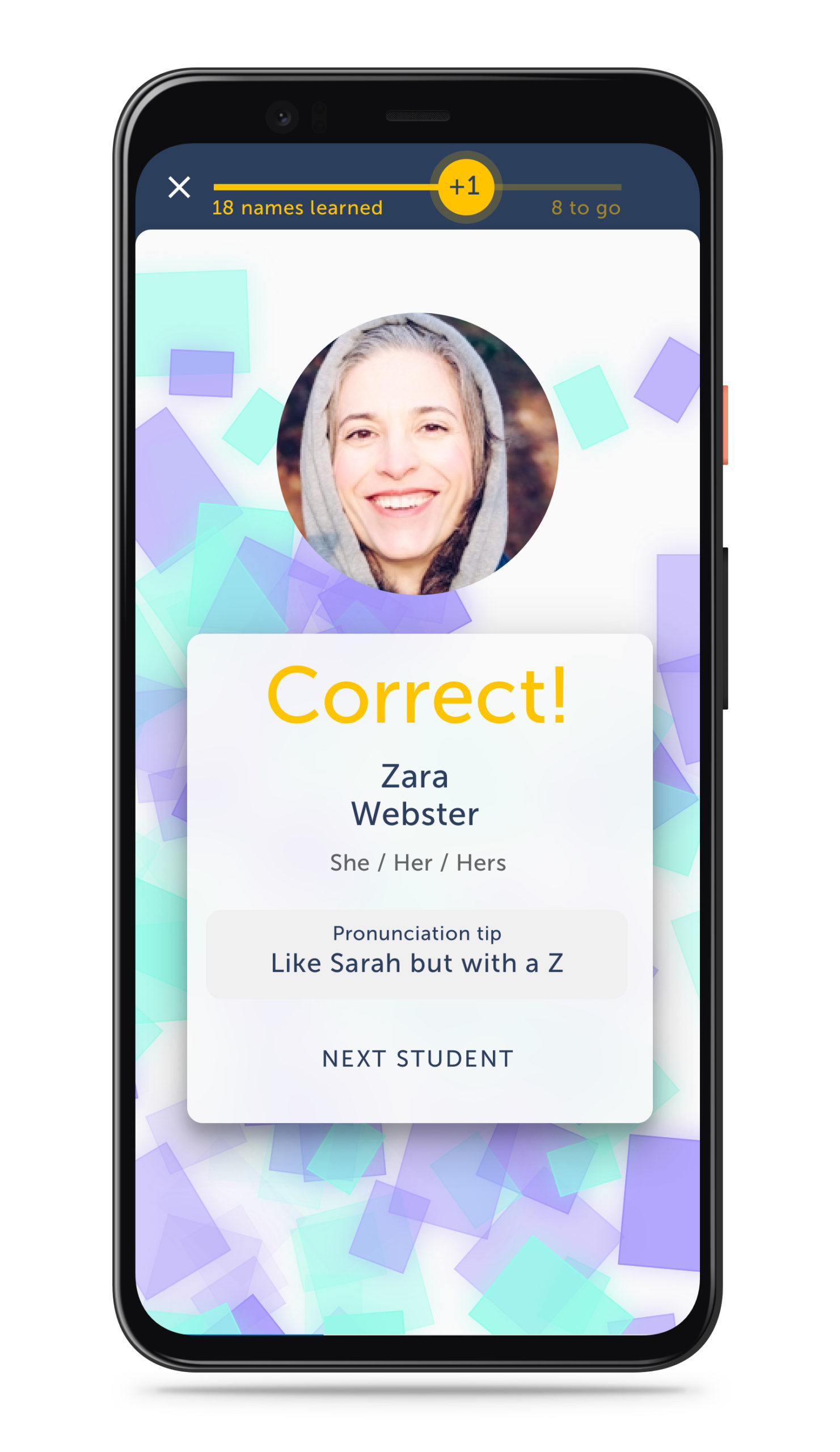
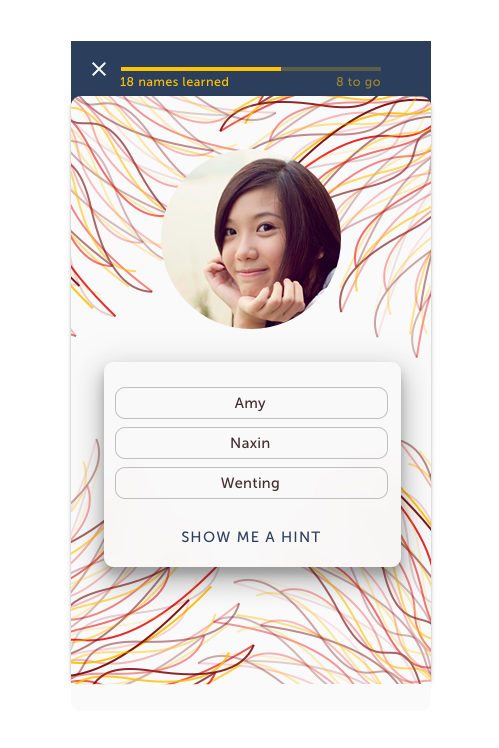
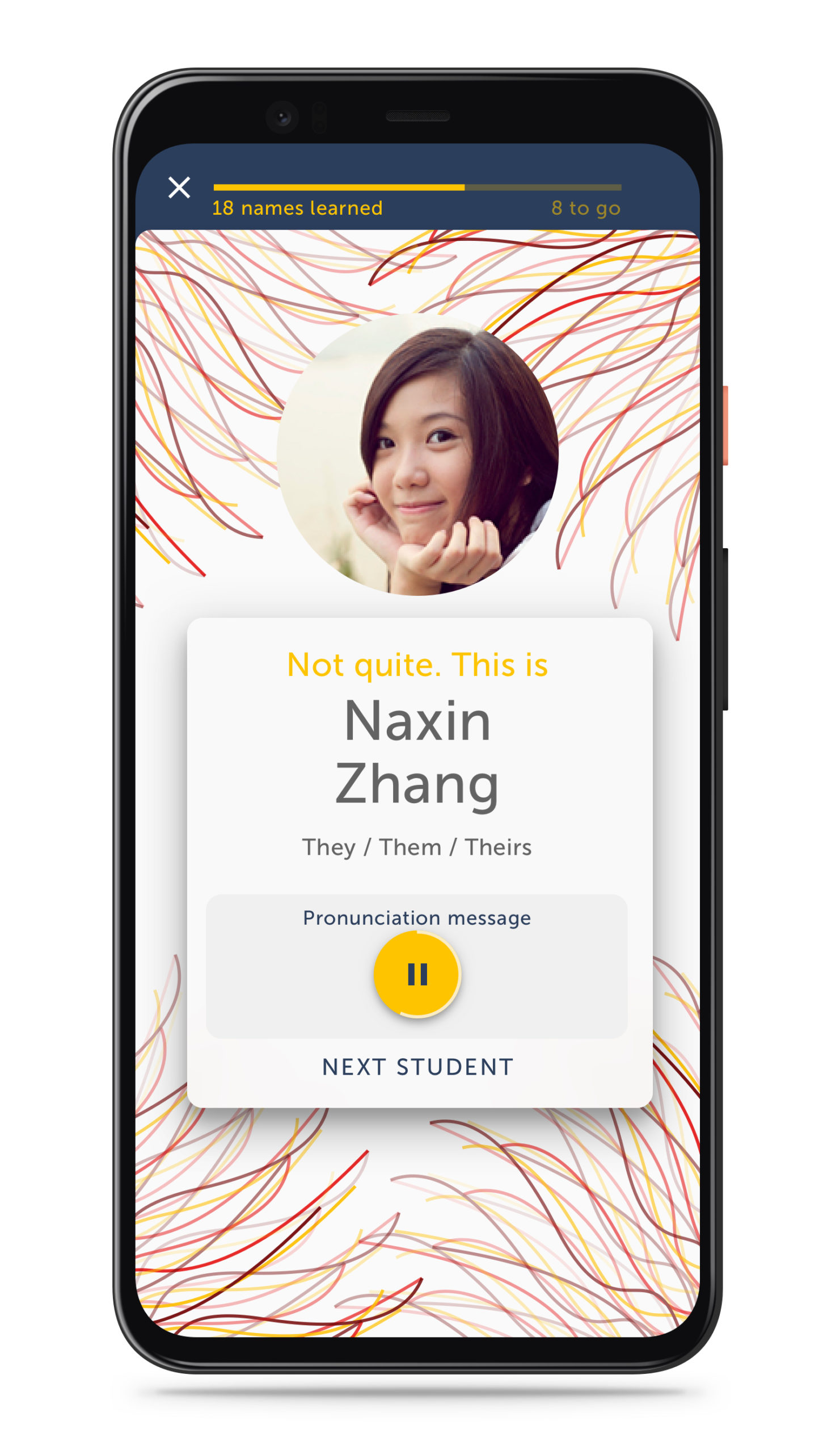
The concept would allow each person using the app to provide a photo, a fun fact about themselves, personal pronouns, and a pronunciation recording if they wanted to.
Selecting from a set of shapes and colors creates a scalable, algorithmically generated backplate that frames the user's profile and adds a distinctive touch.
Designing for a closer social network
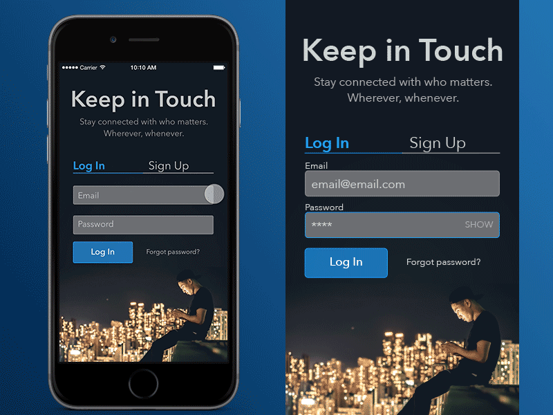
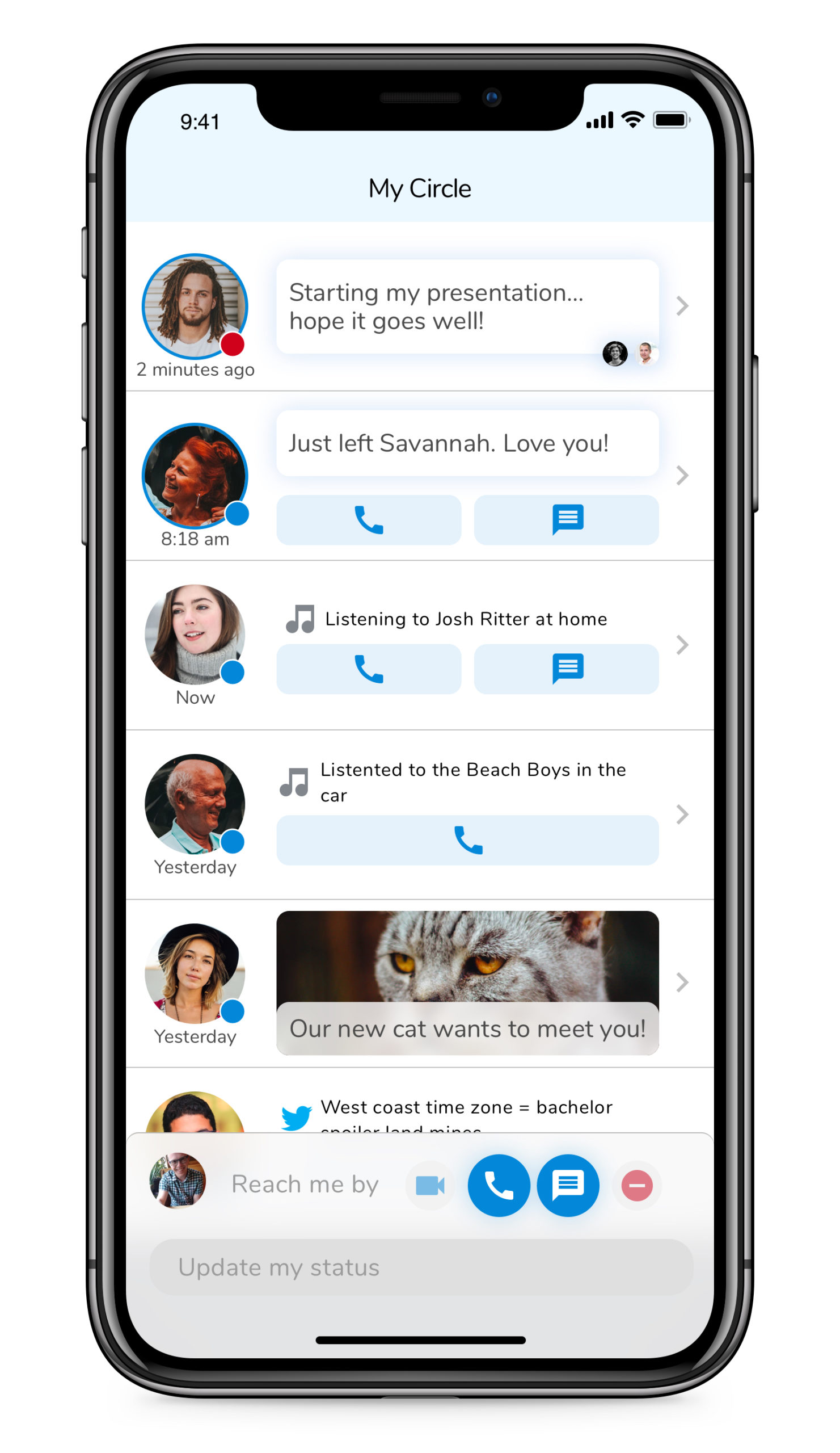
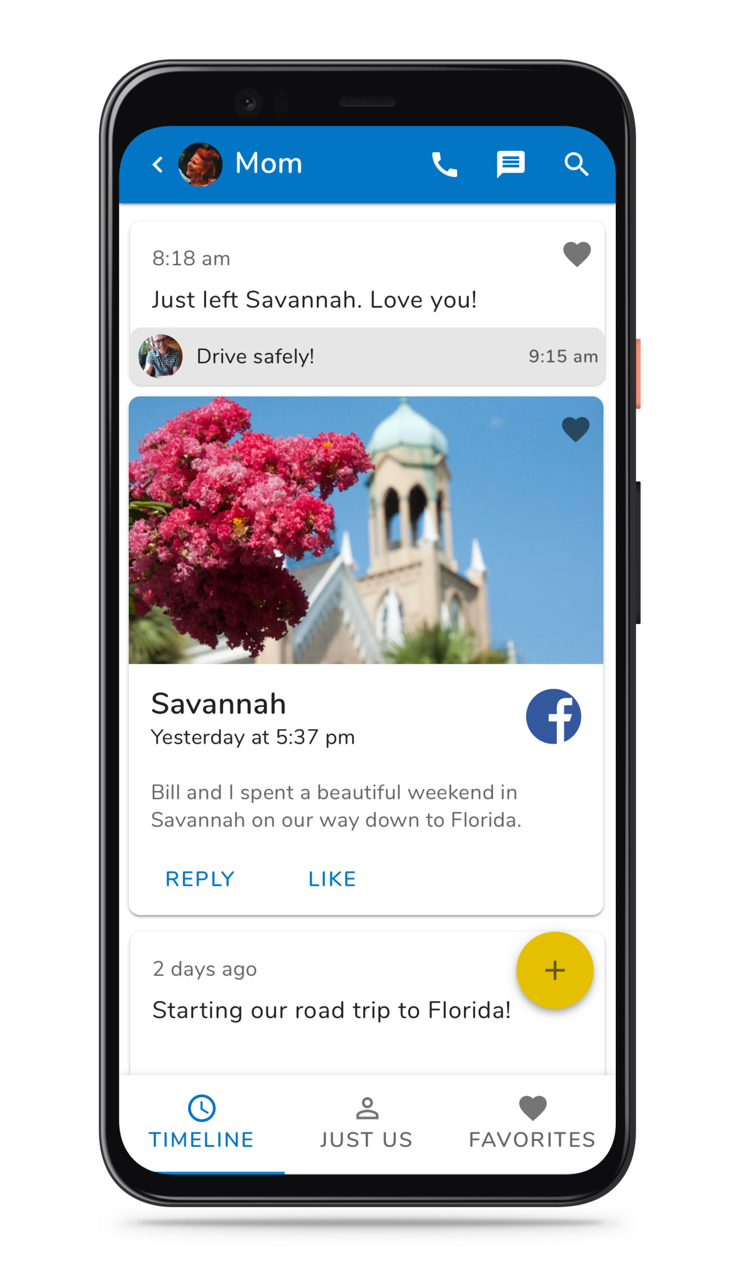
For a while now I've been interested in the idea of a more personal social network. I was an early and enthusiastic adopter of Path and was disappointed when it faded away. In this exercise I wanted to learn more about both Material Design and the iOS Human Interface Guidelines while exploring what a more intimate social network might look like.
Communicating complex health information
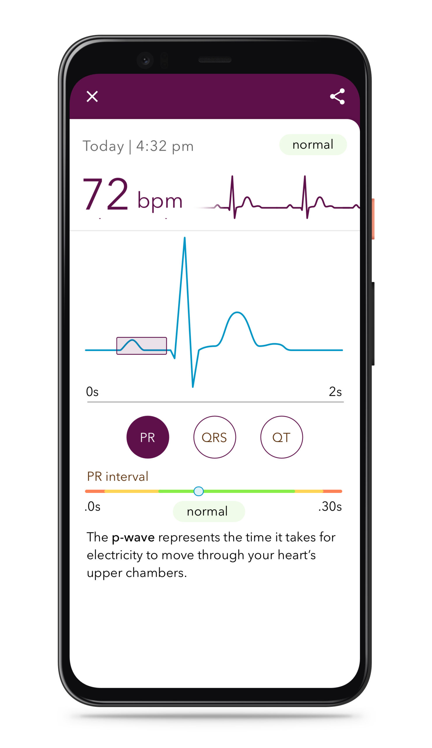
With access to complex medical information and diagnoses becoming easier to produce and access, the role of design becomes ever more important. We're no longer responsible for just helping users find the information, but are now responsible for presenting, curating, and explaining it in a way that's both informative and understandable. It's both a design and content strategy problem that every health-related company faces.
Here I explore how an app might communicate the complexities of an ECG reading and what the right level of information is to communicate to the user.
See more design explorations from dribbble
Other case studies
Quantified WeddingPersonal
Supporting a robot fleet at scaleSavioke 🔒
Simplifying home securitySimpliSafe 🔒
Reimagining the front deskathenahealth 🔒


